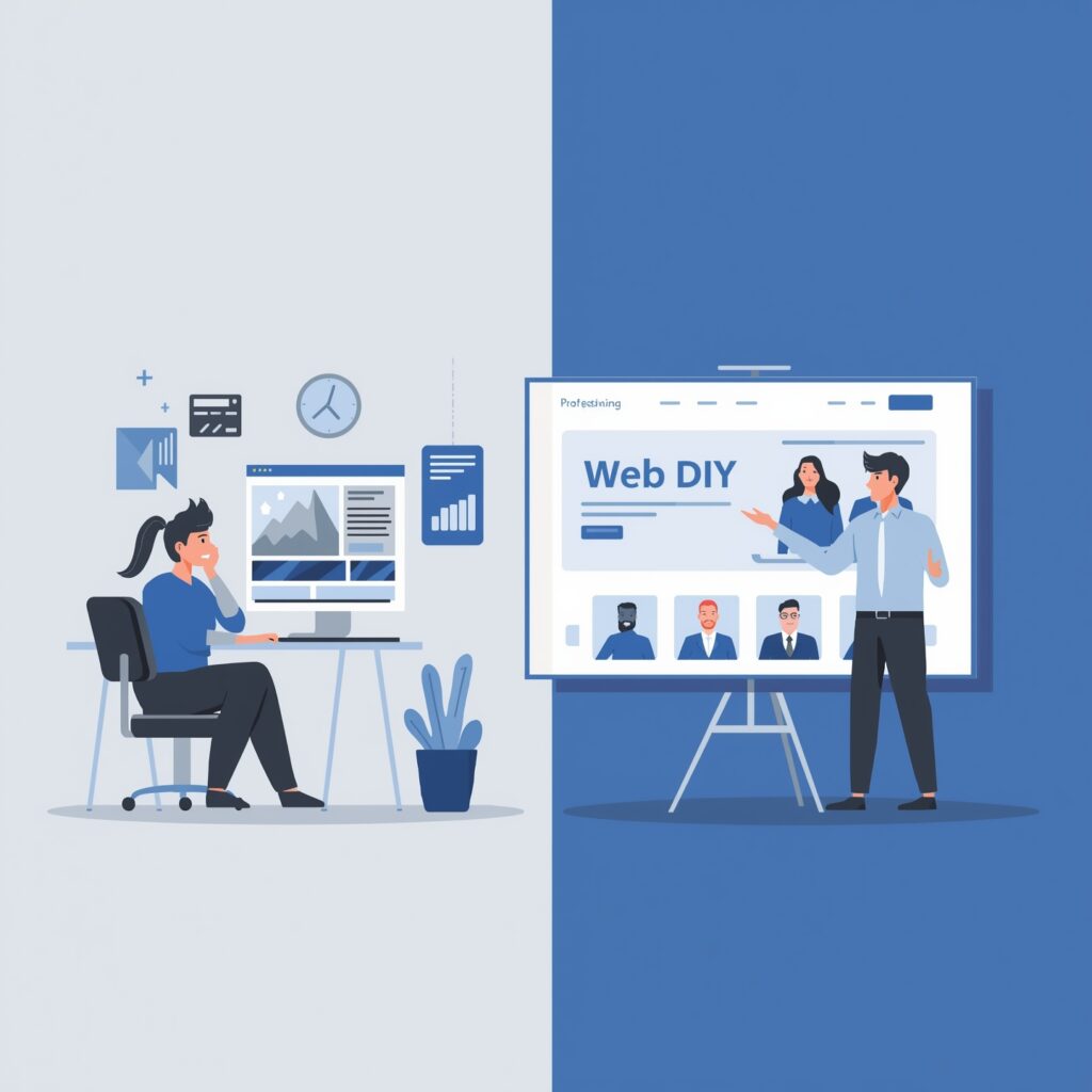
Why Most DIY Websites Fail in 6 Months


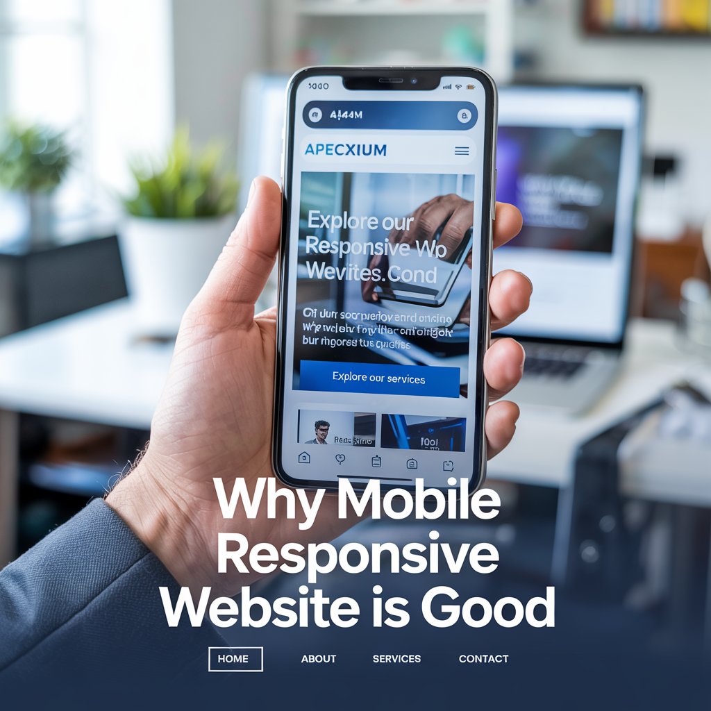
 1. Better User Experience
A mobile responsive site adapts to any screen size whether it’s a phone, tablet, or desktop. That means no more zooming in endless side scrolling or frustrating navigation. When users can easily find what they’re looking for they’re more likely to stick around trust your brand and convert.
Stat: 57% of users say they won’t recommend a business with a poorly designed mobile site.
 2. Improved Search Engine Rankings (SEO)
Google uses mobile-first indexing meaning it ranks your site based on the mobile version first not the desktop one. If your site isn’t mobile friendly your SEO will suffer and you’ll drop in search results.
Responsive design also improves page load speed another huge ranking factor. Faster site = better SEO = more visibility.

 4. Reaches a Broader Audience
With a mobile responsive site you’re accessible to everyone no matter what device they’re using. This opens up your reach especially in countries where mobile is the primary way people access the web.
Plus as new devices (foldables, wearables, etc.) hit the market responsive design makes your site future proof.
 5. Cost-Effective in the Long Run
Instead of managing separate versions of your site for desktop and mobile a responsive website simplifies everything. You’ll save on maintenance updates and future redesigns because you’re working with a single site that flexes to fit.
 Final Thoughts
In today’s digital landscape having a mobile responsive website isn’t just a nice to have it’s a must have.
It’s better for users. It’s better for SEO. And most importantly it’s better for your business.
If your website isn’t performing well on mobile it might be time for a refresh. Contact us and we’ll help you turn your site into a mobile first experience your customers will love.